

- Detroit Pistons

The Pistons’ Classic Edition jersey brings back the team’s 1991-2001 road jerseys. This is easily the best jersey on this list, as its colors are very vibrant. The flaming horse adds a great touch to the jersey which makes the others rank lower.
2. Houston Rockets

The Rockets’ new Classic Edition uniform pays homage to the team’s origin in San Francisco with the green and gold color scheme. These colors look excellent with the Rockets’ name.
3. Denver Nuggets

The Nuggets’ Statement jersey keeps the same model as the previous jersey from the 2018-19 season. This jersey holds such a high ranking because of the flow of colors. It has royal blue paired together with highlighter yellow for the numbers, names, and logos. It also has a burgundy piping on the sides.
4. Phoenix Suns

The Suns returned a jersey from the ’90s as their current Statement Edition jersey. The uniform was born on the 30th anniversary of the jersey’s debut. This revamped jersey looks really clean with the basketball representing the sun bursting logo. The color is something the Suns never struggled with, as their colorway blends in well.
5. Los Angeles Lakers

The Lakers’ new Statement jersey is very impressive, so its a shame they can’t win with it. The purple looks excellent with the black on the sides. The jersey’s secondary color, yellow, is used as trimming, which makes the jersey stand out.
6. Minnesota Timberwolves

The Timberwolves bring a new jersey as their new Statement Edition uniform. The uniform stands out with its unique jersey colors. They feature dark gray as the primary color of the jersey instead of blue. The neon green stands out the most; it isn’t too busy, just simplistic.
7. Milwaukee Bucks

The Bucks released their Classic Edition jersey, brought back from the 1990s and early 2000s. The purple makes the jersey stand out, as they haven’t used the color primarily in decades. The dark green trimming is an attractive color to match with purple, and it blends very well.
8. Washington Wizards

The Wizard’s Classic Edition jersey pays homage to the rebranding of the franchise in 1997. The team mentions that they want to bring some history into play. “To honor their history, the team will celebrate the foundational years of the Wizards’ brand and connect fans to the most significant players, moments, and themes of the last 25 years.” The jersey looks fantastic with the minor detailing of bronze, along with the clean blue highlighting the Wizard’s name and number.
9. Golden State Warriors

The reigning NBA champion Golden State Warriors start the season with a throwback jersey. The retro look is brought back from the ’90s as their new Statement Edition jersey. The uniform is a great jersey to be added to their selection. The yellow trimming makes the jersey pop more. Unlike other teams, the Warriors know how good a simplistic jersey looks.
10. Utah Jazz

The Jazz released four new uniforms as a rebrand: the primary uniform (purple) and the other three as alternate jerseys. The primary jersey pays homage to the classic 1996-97 jersey. Even though the classic jersey is fantastic, the alternate jerseys primarily weigh the Jazz down on this list. The alternate jerseys look very bland and lifeless. Many fans are already looking forward to the Jazz losing these jerseys in the upcoming season.
11. Miami Heat

The Heat bring back the 1996-97 Classic Edition jerseys as a tribute to the franchise’s 35-year lifetime. The jersey looks very similar to the classic devoted jersey. The colorway has the same pallet along with the exact text. However, the jersey ranks lower on the list because of the lack of stripes on the right side.
12. Brooklyn Nets

The Nets’ Statement Edition uniforms recall the classic jerseys from 10 years ago, keeping the core word mark. Designed by Nike, the black-on-black look makes the uniform appear fierce.
13. Los Angeles Clippers

The Clippers Statement Edition jersey revamps the 2020 statement jersey. This jersey does not have a white border anymore, but it has blue and red trimming, which makes this jersey look clean.
14. Boston Celtics

The Celtics’ New City Edition was brought up this year as a tribute to Hall of Famer Bill Russel. The gold is supposed to represent the Golden Ages of the Celtics. This jersey doesn’t stand out in any particular way, as it looks fundamental. Though, the cursive font is unique.
15. San Antonio Spurs

The Spurs released their Statement Edition jerseys, and they aren’t all that impressive. The siding on the jersey is very confusing, as they have never done something like this before. This print looks like it was taken off my mom’s carpet; it doesn’t look good with the solid black. Saint Paul’s sophomore, Noah Montz mentions, “When I first looked at the uniforms, I thought it was some random uniform from a Division II university. However, the SATX on the front is very catchy or appealing to the eye.”
16. Cleveland Cavaliers
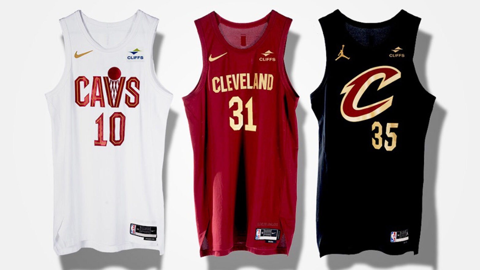
Cleveland releases three new uniforms: the Association (white), the Icon (red), and the Statement (black). They all keep the same simplicity as previous years, but they look like practice jerseys.
17. Portland Trail Blazers

This jersey is a weak addition to Portland’s selection of uniforms; it looks like a Walmart brand jersey. Starting point guard for the Trail Blazers, Damian Lillard, was involved in the design process for this new uniform, and it shows.
“I think Dame needs to stick to decisions ON the court,” said Saint Paul’s senior Ethan Stenger.
18. Charlotte Hornets

Charlotte’s new Statement jersey keeps three primary colors: purple, teal, and white. However, this uniform ranks low primarily due to its lack of originality. They have had very similar jerseys with purple and teal. The honeycomb siding of the jersey shows a terrible design, making it too busy.
19. Orlando Magic

The Orlando Magic’s new Statement uniform brings back the classic design but introduces a slightly new colorway. The camo green does not match the blue, and the stars do not look good with the dark green.
